

No more time wasted sifting through countless threads and websites; we've streamlined all course planning considerations into one effective tool.
OVERVIEW
My Role
UX Design
Prototyping
User Research
Timeframe
Sep 2024 - Jun 2025
Team
Natalie Enman
Maya Gillaspy
Stephen Lines (me!)
Michelle Nguyen
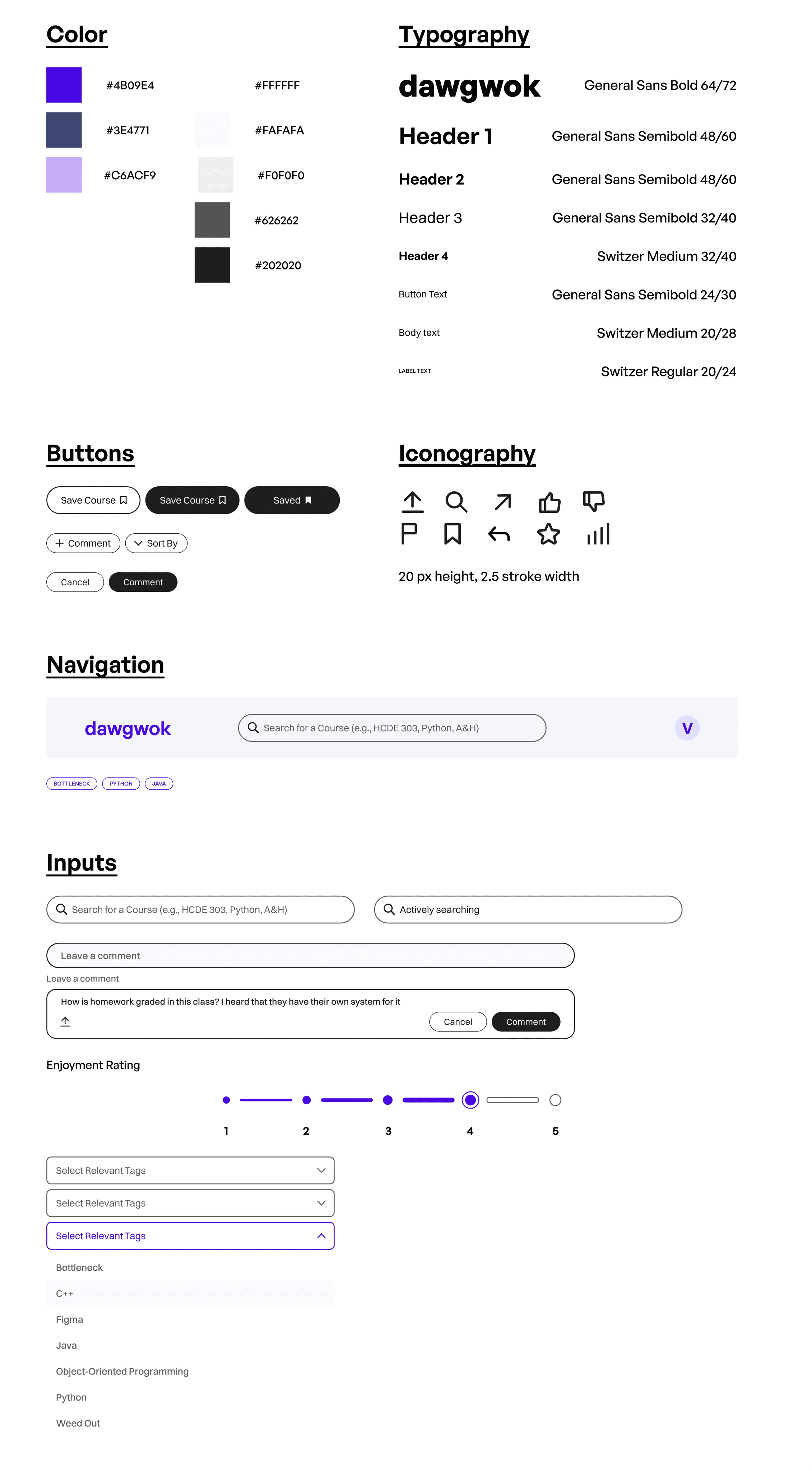
Tools
Figma
Miro
Pen & Paper
Problem
Finding the Best Courses to Take is Stupidly Hard
Over the summer of 2024, I spent some time reflecting on the courses I had taken throughout my past two years at the University of Washington, as well as the courses I had left to take. As I was solidifying my course plan, I realized how many different websites and resources I found myself looking at for advice. While I had accepted this process as the norm for the past two years, it's a bit ridiculous that I need to check 5 or more different websites to decide if I should take a course. I thought to myself:


I brought this problem up to my class group at the start of the school year, and we were all on board to investigate this problem space together over the next 20 weeks in Foundations of Human Centered Design.
Problem Statement
How might we design a solution to support University of Washington underclassmen choose classes that align with their academic goals and reduce scheduling stress?
Competitive Analysis
Course Advice is Fragmented
Our first step when investigating the course discovery/planning process at UW was understanding what the current resources in this problem space offering. Our competitive analysis looked at platforms specifically for University of Washington students (such as MyPlan, UW's degree planning tool) alongside platforms that UW students frequent for schedule advice (such as RateMyProfessor, Slack, and the r/udub subreddit).
Competitive Analysis Findings
1.
Absence of an organization method enabling people to access all advice from students and alumni regarding course selection in an easily accessible manner.

2.
Lack of moderation in shared virtual spaces that do not contain up-to-date information on UW courses, professors, offerings, etc.
3.
There is no verification method on online platforms (such as a visible icon or symbol proving the response is from an actual UW student) proving that people who post information/advice about courses are verified students.
4.
Vague and unclear class descriptions make it difficult to understand what each class covers in terms of content and skills learned.
USER Research
Friction in the Course Discovery Process
We conducted interviews with 8 students and surveyed over 50 people about their experiences with the current course registration system. Our participants included undergraduates aged 18-22 and represented over 25 different majors across engineering, design, humanities, business, and more.
Key Insights
After performing an affinity analysis on our interviews, we discovered 3 main issues students faced when discovering and registering for courses:
Course Information isn't Centralized
While advisors were knowledgeable about which courses students needed to take to meet their degree requirements, they were not aware of the actual content of the courses or the skills and knowledge gained from them.
"I like had to search up the professors and then I need to like search up how the classes in general on Reddit. So just like there's just so many different tools that you need to use."
Natalie
"I still have to do external research after referencing MyPlan’s DARS"
Stephen
"I just always have tons of tabs open when planning and looking at classes because I want to look at student feedback, course descriptions, etc. and they are all in different places"
Maya
Need to check different sources to see what classes they are eligible to take (e.g., what classes have prerequisites)
Michelle
Lack of Course Clarity
Students reported that course descriptions online were uninformative as to what courses actually consist of, or the requirements entailed to enroll in a specific class. Students also reported that a lot of information available online about these courses was inaccurate or out-of-date, leading to more confusion among students.
"I took a class that sounded fun in the description but I felt like I wasted my time because it was lame and I didn’t even fulfil any requirements."
Maya
All course descriptions on MyPlan are vague
Natalie
It’s unclear what each course entails in description
Maya
Credit hours are not always accurately representative of work load, so I don’t know how hard a class will really be
Natalie
Academic Advisors Time & Knowledge is Limited
While advisors were knowledgeable about which courses students needed to take to meet their degree requirements, they were not aware of the actual content of the courses or the skills and knowledge gained from them.
Advisors don’t have insight on specific courses and aren’t as helpful
Stephen
Advisor has vast workload and probably have a lot of other word to do than plan my schedule
Michelle
I just don’t meet with my advisor often
Stephen
So many advisors, and they give more general than specific info
Maya
This insight was further supported in our supplementary survey, where we asked students to rate their experience using various course planning tools and resources.
43%
of our survey respondents did not find advisors useful or do not use them.
Inequality in the User Flow
Our interview revealed evident friction in the process of looking for courses, determining whether said courses are useful or worthwhile, and actually registering for those courses. This was largely due to how current resources were designed and organized.
From these findings, we introduced Alex, our persona, to help us align user needs with actionable pain points that we could address in our final solution.
Alex
The Ambitious Planner

Age
20
Education
Sophomore
Major
Pre-Sciences
“I like to [plan my schedule] generally within like, one or two months out once the section times are finalized.”
Personality
Organized
Friendly
Proactive
Sociable
Scenario
During course registration, Alex aims to fulfill major application requirements with a balanced course load but struggles with the complexity of finding accurate information and matching classes to degree requirements, making the process time-consuming.
Goals
Fulfill application requirements for majors
Maintain a balanced course load
Minimize time spent researching courses.
Needs
Accurate course details, schedules, and reviews
Clear guidance on major-specific requirements and versatile class options
Streamlined planning and decision-making process
Pain Points
Overwhelmed by disorganized course information spread across multiple platforms
Frustrated by the lack of cohesive resources for course planning
Stressed about securing a desired major as a pre-major student
Design Requirements
After synthesizing our findings, we laid out the design requirements for our solution, which helped us stay on track as we moved into the ideation/prototyping phase.
Review specific UW courses to create more transparency for prospective students
Synthesize data from multiple different course planning resources for students
Reduce time UW students spend exploring and planning courses.
Highlight highly-rated/popular courses that students should take depending on their needs
Mentor other UW students on course/schedule planning for their own major
Provide up-to-date course information to students
Key Opporunity
How can we create a platform that fills in the gaps left by academic advisors and and University of Washington resources to optimize the undergraduate course planning experience?
ideation
Exploring Potential Features
In our early ideation, we heavily focused on social functionality of our product, in line with our findings that students want candid feedback from fellow students. We also thought about the kind of data that students cared about when, which tied back to our survey results.

Overview pages for different courses and majors, allowing students to share tips, tricks, and insights to succeed. Students can review courses as well as ask questions in a comment section.
Data aggregation for different courses. Displays relevant information about grading, restrictions, pre-requisites, and course timings to save students time digging through 3+ different UW resources.

Mentorship from students already admitted into their major. Students could book times with these mentors to get advice on courses their taking, clubs to join, or career paths from students who have been in their shoes before.
Early sketches for our ideas, brainstorming ways to display data and student input.
While we were very excited with all of these features, the timeline for this project was very short. As such, we prioritized implementing the course overview aspect of our solution first. Another piece of feedback we received from industry professionals was to incorporate some kind of AI model that students could interact with to help with schedule planning. This lead to the creation of the WOK, an AI summarizer that helps students make smarter course decisions.

As we continued to build out our ideas, we referred back to our Value Proposition Canvas, mapping the Gains, Pains, and Jobs identified earlier to tangible outcomes our product could produce.
feedback and iterations
Refining Our Strengths and Scope
We began gathering user feedback via concept testing on our low-fidelity prototype. Through this, we identified small changes regarding accessibility and usability as well as larger conceptual challenges that shaped our final designs.

Home page

Course Overview page
Personalization
Students wanted the Dawgwok platform to be more tailored towards their academic and career goals, instead of being shown generalized course recommendations like we intially designed.
Takeaways:
Tailor Recommend Courses bin to reflect student’s major or intended field of study
Display course difficulty ratings to help assess workload and GPA impact
Show course availability per quarter to assist in long-term planning
Expand course tags to provide more apt ways of describing courses
Add sort and filter options for easier navigation
Privacy and Content Moderation
Another concern students expressed was the use of UW NetID (student identification) on our platform. While the ability to leave reviews, comments, and ratings was very useful, our users were unsure if their posts were moderated and whether or not UW professors and faculty could see them (and tie it back to their student ID).

Example comment, where students name and identifying information is viewable.
Takeaways:
Clearly explain moderation policies and post visibility.
Offer anonymous posting with user control over comment visibility.
Implement a privacy policy notification before posting.
Clarifying Key features
In general, some of the functionality of our products features needed refining. A big issue that arose was distinguishing between comments and reviews, another being how the Saved Course button on the course overview page interacted with websites like MyPlan.
Comment section displaying a review (top), and a regular comment (bottom). Hard to tell the difference, right?

Takeaways:
Redesign reviews vs. comments for distinct purposes or merge them.
Clarify how course ratings are generated.
Rename or add hover explanations for Saved Courses and Post History to remove ambiguity.
Introduce a filter system for Post History, allowing users to sort interactions by category.
Usability Testing and Improvements
As we moved our product to mid-fidelity, we conducted user testing with three UW students to get feedback on the functionality of our solution.

Mid-fidelity Home and Course Overview Pages

Revamped Course Card, featuring more relevant information such as academic rigor (GPA) and tags related to the course

Revamped Course Overview.
Our usability testing offered great insights going into the final couple weeks of refining our prototype. This phase of development showed how needed it was for students to be able to filter courses, comments, and reviews, as well as highlighted some terminology used that could be refined for clarity.
Final solution
Introducing Dawgwok
After 20 weeks of research, prototyping, testing, and iterations, we had the opportunity to showcase Dawgwok to our classmates and industry guests! We got a lot of great feedback regarding accessibility (inputs and breadcrumbs) and information architecture (how we organized comments) that we were eager to implement post-presentation.
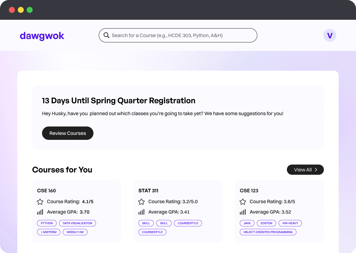
1
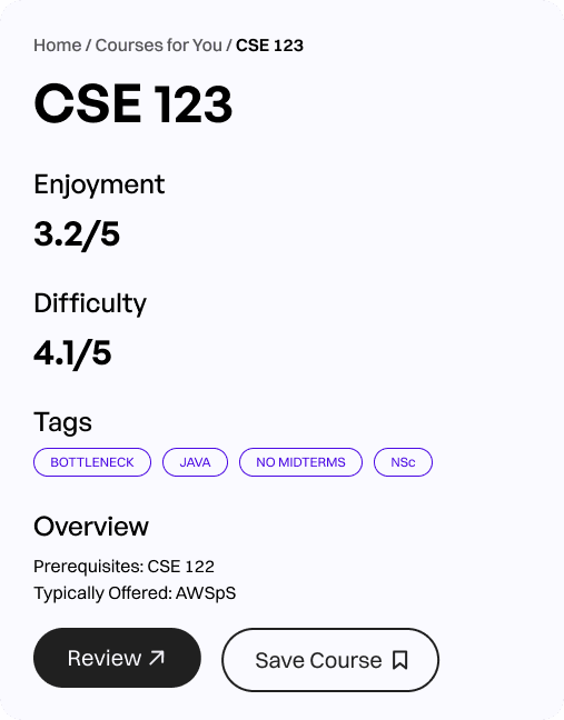
Courses For You
Our home page features a "Courses for You" selection at the top of the page. Recommendations are based on major and/or field of interest, in line with our findings from testing sessions.
The profile page also helps students keep track of their saved courses and post history for easy access and tracking.

2
Filter by Tags
Students can add relevant tags to courses to help tailor recommendations. Tags can relate to grading style, skills learned, software used, and more!
Tags can also be interacted with to filter searches, adding another layer of personalization to our platform.
3
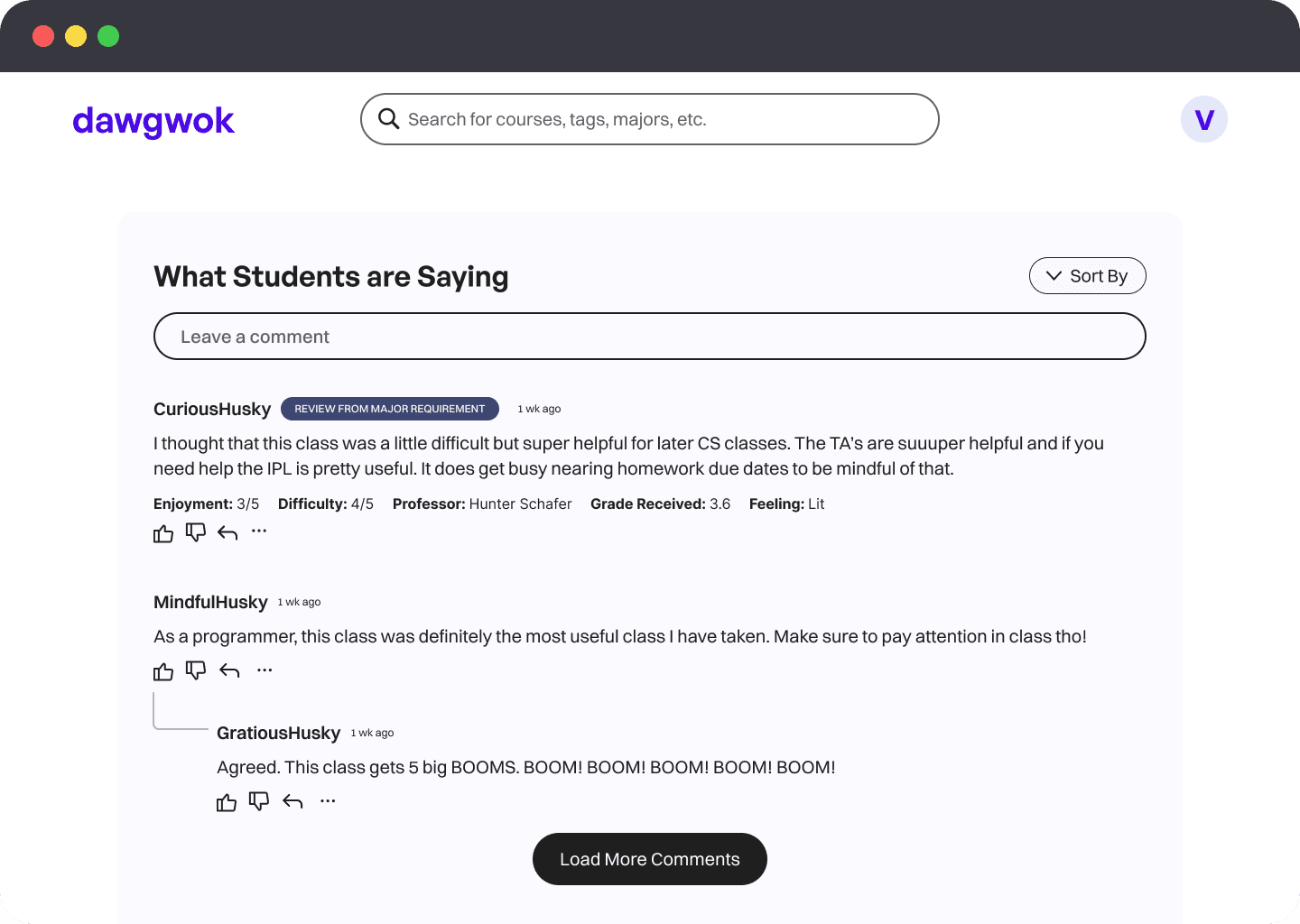
Reviews and Comments
Refining how comments and reviews worked on our platform was a huge challenge for us, and we're still investigating how to improve clarity here as we move beyond the classroom!
To help further distinguish between course reviews and comments, we included a header that indicates a review, as well as the students relationship from the course (taken from the review).
Many students found this to be intuitive in our usability testing, though we are still fine-tuning the presentation of this.
⬇

Any user can add comments, regardless of whether or not they are signed into the platform. This ensures that prospective students who may have questions can also access this resource.
All users are kept anonymous and usernames are randomized between different course pages.
Full Prototype
Reflection
Enjoying the Process
It was awesome to see Dawgwok go from a loose idea to cohesive solution over the past six months. Getting involved in each part of the user-centered design process exposed me to new methods and frameworks that I know will be useful as I go out and work on more products in the future. I think our team's passion for this problem space really shined as we worked together to develop our UI.
Looking back at the structure of the class, I wish our group started designing a little earlier; near the end we definitely felt more rushed as we were finalizing our designs, so beginning to prototype earlier and get user feedback sooner would have been huge for us.
Our biggest challenge was definitely figuring out how to display all the information that students found useful when planning courses. We didn't want to overload users by having a cluttered interface, so we did our best to organize data in a way that made sense to students while not overwhelming them.
What's Next?
Going forward, our group is looking to iron out more details in our high-fidelity prototype, and potentially collaborate with other developers, researchers, and designers to help bring Dawgwok to life for UW students. Stay tuned!